CSS Horizontal Navigation Bar
Horizontal Navigation Bar
There are two ways to create a horizontal navigation bar. Using inline or floating list items.
Inline List Items
One way to build a horizontal navigation bar is to specify the <li> elements as inline, in addition to the "standard" code from the previous page:
Example explained:
display: inline;- By default, <li> elements are block elements. Here, we remove the line breaks before and after each list item, to display them on one line
Floating List Items
Another way of creating a horizontal navigation bar is to float the <li> elements, and specify a layout for the navigation links:
Example explained:
float: left;- Use float to get block elements to float next to each otherdisplay: block;- Allows us to specify padding (and height, width, margins, etc. if you want)padding: 8px;- Specify some padding between each <a> element, to make them look goodbackground-color: #ddd;- Add a gray background-color to each <a> element
提示: Add the background-color to <ul> instead of each <a> element if you want a full-width background color:
Horizontal Navigation Bar Examples
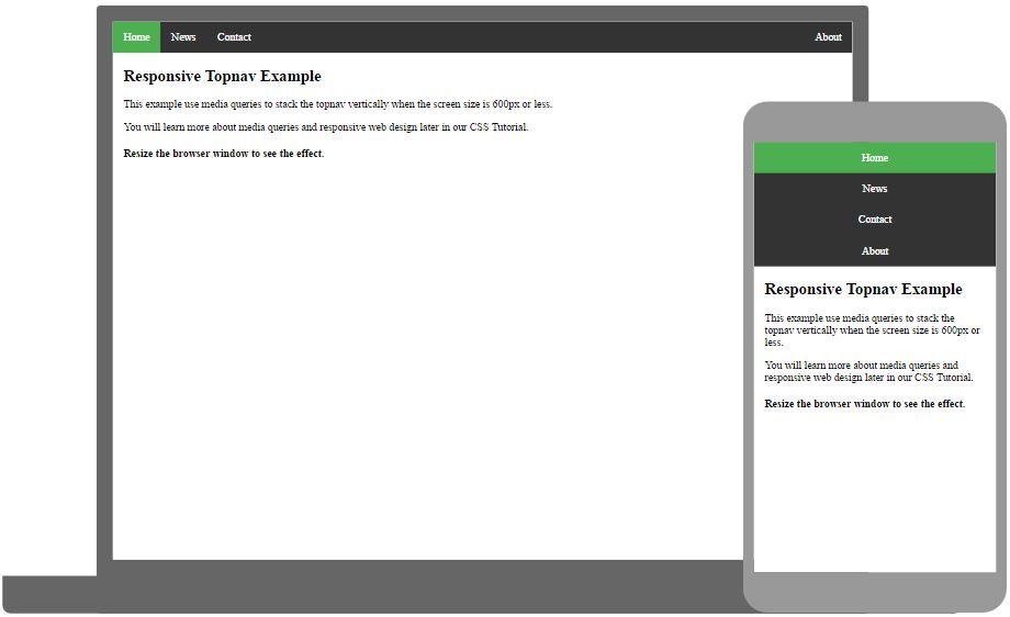
Create a basic horizontal navigation bar with a dark background color and change the background color of the links when the user moves the mouse over them:
例子
ul {
list-style-type: none;
margin: 0;
padding: 0;
overflow: hidden;
background-color: #333;
}
li {
float: left;
}
li a {
display: block;
color: white;
text-align: center;
padding: 14px 16px;
text-decoration: none;
}
/* Change the link color to #111 (black) on hover */
li a:hover {
background-color: #111;
}
亲自尝试 »
Active/Current Navigation Link
Add an "active" class to the current link to let the user know which page he/she is on:
Right-Align Links
Right-align links by floating the list items to the right (float:right;):
例子
<ul>
<li><a href="#home">Home</a></li>
<li><a href="#news">News</a></li>
<li><a href="#contact">Contact</a></li>
<li style="float:right"><a class="active" href="#about">About</a></li>
</ul>
亲自尝试 »
Border Dividers
Add the border-right property to <li> to create link dividers:
例子
/* Add a gray right border to all list items, except the last item (last-child) */
li {
border-right: 1px solid #bbb;
}
li:last-child {
border-right: none;
}
亲自尝试 »
Fixed Navigation Bar
Make the navigation bar stay at the top or the bottom of the page, even when the user scrolls the page:
Note: Fixed position might not work properly on mobile devices.
Gray Horizontal Navbar
An example of a gray horizontal navigation bar with a thin gray border:
Sticky Navbar
Add position: sticky; to <ul> to create a sticky navbar.
A sticky element toggles between relative and fixed, depending on the scroll position. It is positioned relative until a given offset position is met in the viewport - then it "sticks" in place (like position:fixed).
Note: Internet Explorer do not support sticky positioning. Safari requires a -webkit-prefix (see example above). You must also specify at least one of top, right, bottom or left for sticky positioning to work.


